Meaningful availability, Hauer et al., NSDI’20
With thanks to Damien Mathieu for the recommendation.
This very clearly written paper describes the Google G Suite team’s search for a meaningful availability metric: one that accurately reflected what their end users experienced, and that could be used by engineers to pinpoint issues and guide improvements.
> A good availability metric should be meaningful, proportional, and actionable. By "meaningful" we mean that it should capture what users experience. By "proportional" we mean that a change in the metric should be proportional to the change in user-perceived availability. By "actionable" we mean that the metric should give system owners insight into why availability for a period was low. This paper shows that none of the commonly used metrics satisfy these requirements…
The alternative that Google settled on is called windowed user-uptime and it’s been used in production across all of G Suite for the past year. We’ll look at how windowed user-uptime works in a moment, but first let’s review commonly used approaches to availability reporting and why they failed Google’s test.
Counting nines
The basic form of an availability metric is the ratio of ‘good’ service to the total demanded service: availability = good service / total demanded service. They’re often described in terms of ‘number of nines’ (e.g. ‘five nines availability’). Now we just have to decide what we mean by ‘service’, ‘good’, and ‘total demand’.
Time-based availability metrics are probably what comes to mind first for most people. Here we can say that availability = uptime / (uptime + downtime). A fancier way of expressing the same thing is MTTF / (MTTF + MTTR) (mean-time-to-failure and mean-time-to-recovery). For a non-fault-tolerant system where all users experience failures identically that can be ok, but what does ‘downtime’ mean for a distributed system where some failure somewhere is normal. Is the system only down if it’s down for all users? If it’s down for any single user? If it’s down for some threshold percentage of users? These limitations mean that such metrics are not meaningful in that they rely on arbitrary thresholds and they’re not proportional to the severity of system unavailability. They’re also not proportional to the number of affected users (downtime during peak demand periods != downtime in quiet periods).
To try and overcome these limitations, some systems have turned to count-based availability metrics, the most common of which is the success ratio: availability = successful requests / total requests. This is more proportional than time based metrics but not without issues:
- The metric is skewed towards the experience of high volume users (G Suite reports 3 orders of magnitude difference in activity levels across users)
- Users make less requests when a system is perceived to be down, which also skews the metric
- The metric is less meaningful to end users because it does not capture any notion of how long a system was unavailable.
Both time-based and count-based metrics are also hard to turn into actionable insights…
> …none of the existing metrics can distinguish between 10 seconds of poor availability at the top of every hour or 6 hours of poor availability during peak usage time once a quarter.
The first of these is an annoying but relatively minor nuisance, the second is a major outage!
Making availability meaningful and proportional
One person’s uptime is another person’s downtime (‘Is it down for you? It’s down for me…’). By considering uptime (downtime) from the perspective of individual users, we can combine the strengths of time-based and count-based metrics to give a meaningful and proportional metric: user-uptime.
> Since this metric is in terms of time, it is meaningful to users. Since it is free from arbitrary thresholds, it is (inversely) proportional to the duration and magnitude of unavailability.
So how do we measure per-user up(down)time? We could use probe requests, sent at regular intervals, which would look like this:
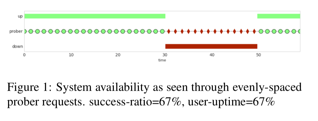
The challenge here though is that it’s hard to create probes which accurately reflect the wide variety of real user requests. So what if we used real user requests instead? This accurately captures user experience, but now we have another problem: users don’t make nice evenly spaced requests through time:
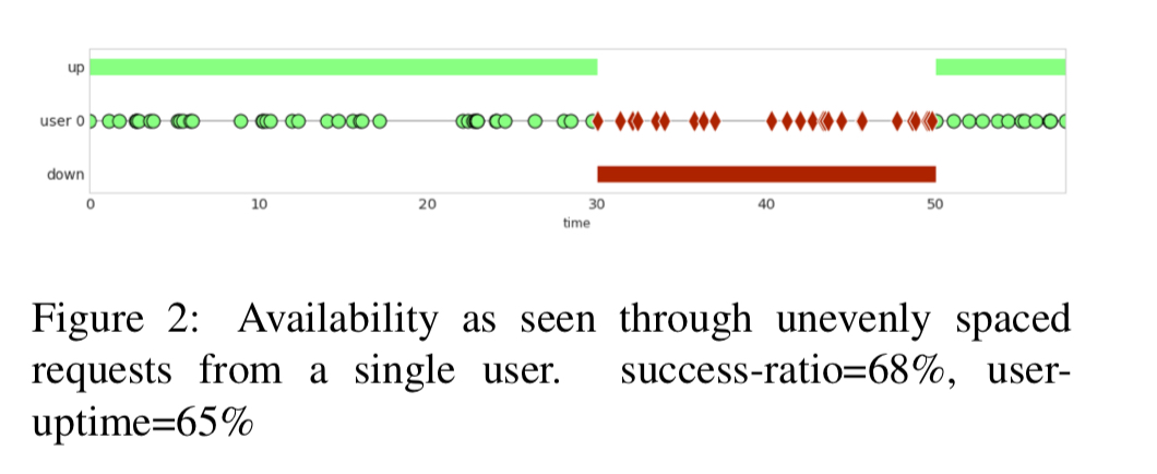
Google handle this with the following rule:
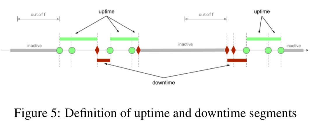
- After a successful (or failing) operation, assume that the system is up (or down) until the user sees evidence to the contrary.
What about a user that makes an unsuccessful request and then doesn’t interact with the system for several days? Should the system be seen as down for that user for all that time? Intuitively this doesn’t feel right. So the final embellishment is a cutoff duration, set at the 99th percentile of the interarrival time for user requests (30 minutes for Gmail). If no request arrives within the cutoff duration the segment is marked as inactive and does not count towards user downtime or uptime.
Making availability actionable
To make availability information actionable, we want to be able to distinguish between outages of different durations (e.g. one user outage of 1000 minutes, vs 1000 outages of 1 minute). In general, the bigger the window you examine availability over, the better the availability figure looks. To address this, windowed user-uptime combines information from all timescales (window sizes) simultaneously. For a given window size w, availability is computed by enumerating all windows of size w, computing the availability of each, and then taking the lowest value. Taken together the results are called the minimal cumulative ratio or MCR.
Here’s an example:
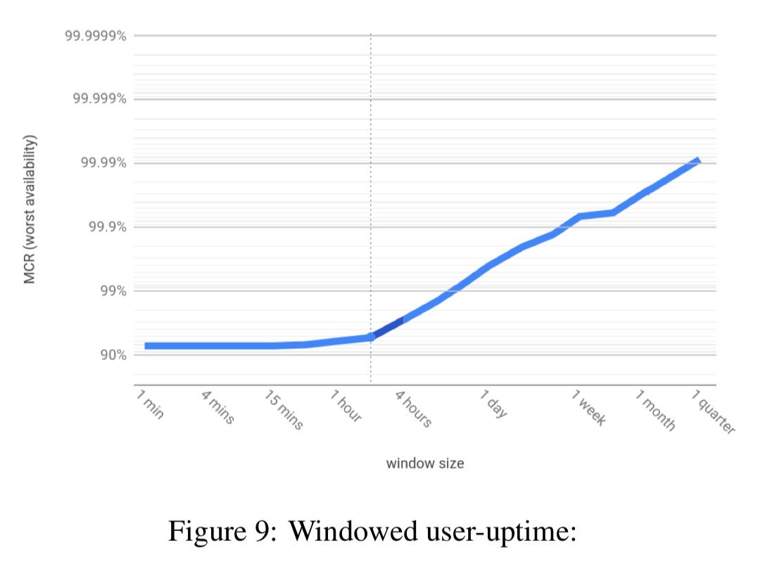
These plots are really rich in information. For example here we can see at a glance that:
- The overall availability for the quarter is around 99.99%
- There was no window of one minute or longer with availability worse than 92%, and …
- From the knee of the curve (at around 2 hours) we can infer the episode bringing availability down to 92% lasted for around two hours.
The knee of the curve tells us window sizes of interest. Then you can drill in by looking at windows of that size over time:
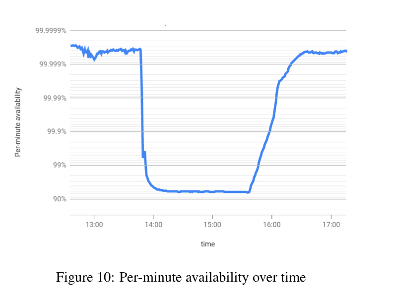
> This data is actionable, it tells us the windows that degrade our overall availability. Our engineers use these graphs to find and fix sources of unavailability.
To keep things nice and simple ( as a monotonic function, see section 5.2 in the paper), keep your window sizes as linear multiples of each other (e.g. powers of two).
Windowed user-uptime in production
Section 6 contains scaled and shifted production data from Google that illustrates all of the discussed availability limitations of time-based and count-based metrics, and gives examples of windowed up-time in action.
For example, here’s a plot of windowed user-uptime for Google Drive and Hangouts over a month.
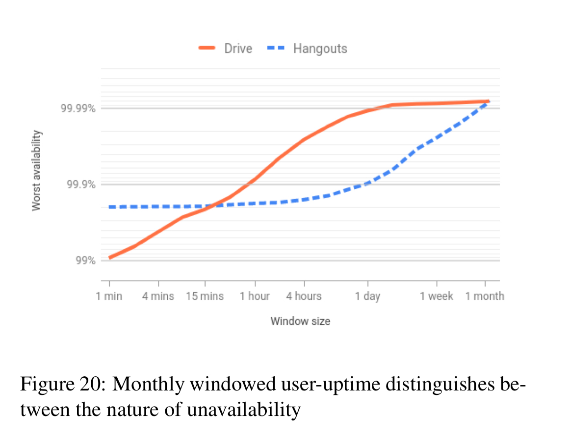
You can see that Hangouts’ availability was impacted by a four-hour episode (knee of the curve), whereas for Drive there is no pronounced kenn, indicating that rather than any single long outage, it’s frequent short outages that are holding the service back from having a higher availability. "Thus, unless we fix their root cause, Drive will continue to suffer from these downtimes month after month."
To be able to slice data along multiple dimensions (e.g. organisation, operation type, and so on), it is necessary to store data at the finest level of window granularity for each dimension.
The last word…
> …we are confident that windowed user-uptime is broadly applicable: any cloud service provider should be able to implement it.
Windowed availability indeed looks like a substantial advance… but I can’t shake this feeling that it’s not the end of the conversation, and that something better won’t come along…
For example: major incidents don’t need to be graphed, and indeed they visually compete (in this format) with other data.
Also, this graph format seems light on information you might want to help diagnose the root cause (s)… ?