Same stats, different graphs: generating datasets with varied appearance and identical statistics through simulated annealing Matejka & Fitzmaurice et al., CHI’17
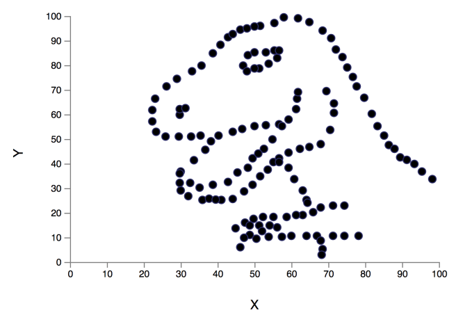
Today’s paper choice is inspired by the keynote that Prof. Miriah Meyer gave at the recent Velocity conference in London, ‘Why an interactive picture is worth a thousand numbers.’ She made a wonderful and thought-provoking case for the power of visualisations, and especially visualisations you can interact with, playing a central role in our process of understanding. Better ways of seeing and exploring data lead to better insights. Meyer opened her talk by showing us Cairo’s Datasaurus (‘Never trust summary statistics alone; always visualize your data’).
You can calculate all the statistic summaries you like over the datasaurus dataset, run regressions, perform clustering, and so on. But until you look at it with the right visualisation, you’re never going to reach the same understanding as you get from looking at the data this way:
Since the early 70’s, Anscome’s Quartet has been frequently used to illustrate the importance of graphical representations when exploring data:

The effectiveness of Anscombe’s Quartet is not due to simply having four different data sets which generate the same statistical properties, it is that four clearly different and identifiably distinct datasets are producing the same statistical properties.
In ‘Same Stats, Different Graphs,’ Matjeka & Fitzmaurice show a method for purposefully creating datasets which are identical over a range of statistical properties (of your choosing), yet produce dissimilar graphics. In my mind there’s a connection here to the idea of adversarial inputs to deep neural nets, which we might similarly express on some level as ‘Same Stats, Different Classes.’ Another thing I get from this paper is a very visual reminder of ‘Same Outcome (in terms of stats), Different Causes.’ There are lots of different hypotheses you could come up with that may produce the effect you’re seeing.
Their method doesn’t just produce datasets that retain the same statistical properties while looking different though, it also allows you to guide the way in which the visualisation looks different (a bit like crafting an adversarial input to produce a specific mis-classification). For example, in the figure below we have an initial data set (top left) and a set of target shapes for data set generation.
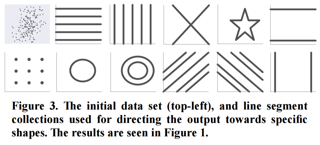
Here are the results produced by the technique when using these target shapes – every one of these has the same summary statistics as the initial dataset!

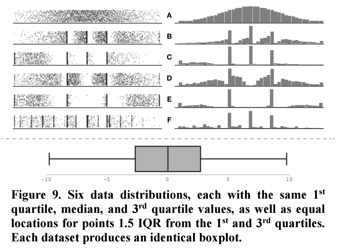
These examples are all in 2D, but there’s nothing about the technique that limits it to two dimensions. Here are some 1-D examples:
How it works
The key insight behind our approach is that while generating a dataset from scratch to have particular statistical properties is relatively difficult, it is relatively easy to take an existing dataset, modify it slightly, and maintain (nearly) the same statistical properties. With repetition, this process creates a dataset with a different visual appearance from the original, while maintaining the same statistical properties. Further, if the modifications to the dataset are biased to move the points towards a particular goal, the resulting graph can be directed towards a particular visual appearance.
In pseudo-code, it looks like this:
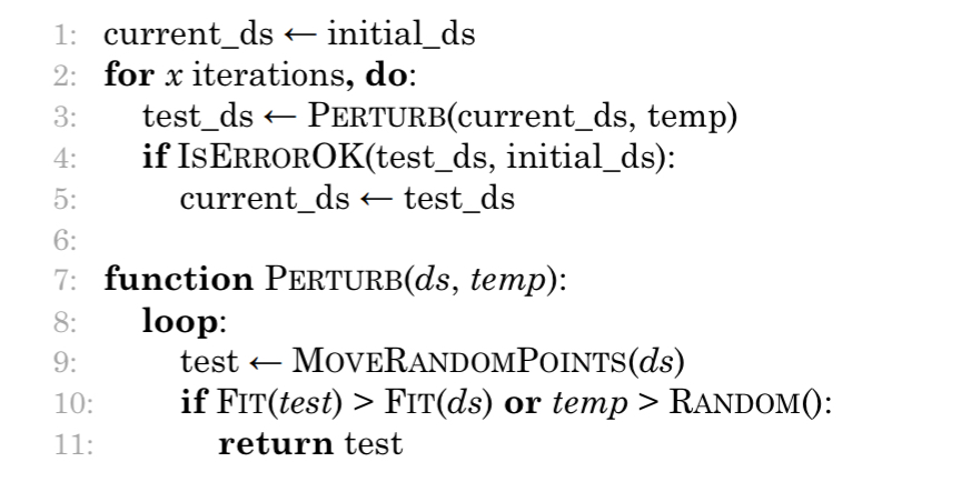
Where:
- Initial_ds is the seed dataset defining the statistical properties which should be maintained
Perturbmodifies the current version of the dataset by moving one or more points by a small amount in a random direction. The small amount is chosen from a normal distribution and calibrated so that 95% or more of movements should result in the overall statistical properties remaining unchanged (to two decimal places). The temp parameter is a temperature used for simulated annealing.- The
Fitfunction checks if perturbing the points has improved the overall fitness, and accepts it if so. When coercing the dataset into a target shape, it uses the average distance of all points to the nearest point on the target shape. - To avoid getting stuck in a locally-optimal solution, a perturbation may also be accepted if the current temperature is greater than a random number between 0 and 1. Temperature starts out at 0.4, and is gradually reduced to 0.01 using a quadratically-smoothed monotonic cooling schedule.
- The newly returned perturbation is then tested (
isErrorOk) to ensure that overall stats have not changed (within 2 decimal places), and becomes the current dataset if so.
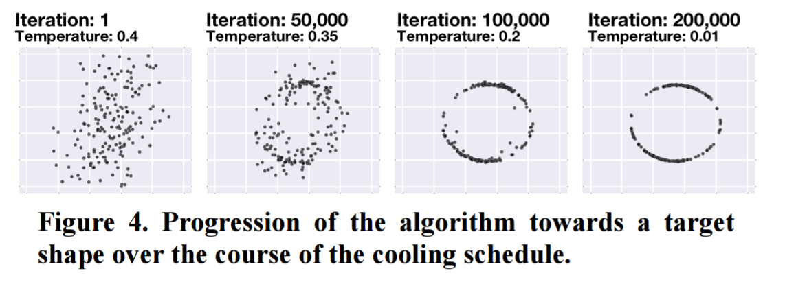
Here’s an example of dataset evolution across 200,000 iterations:
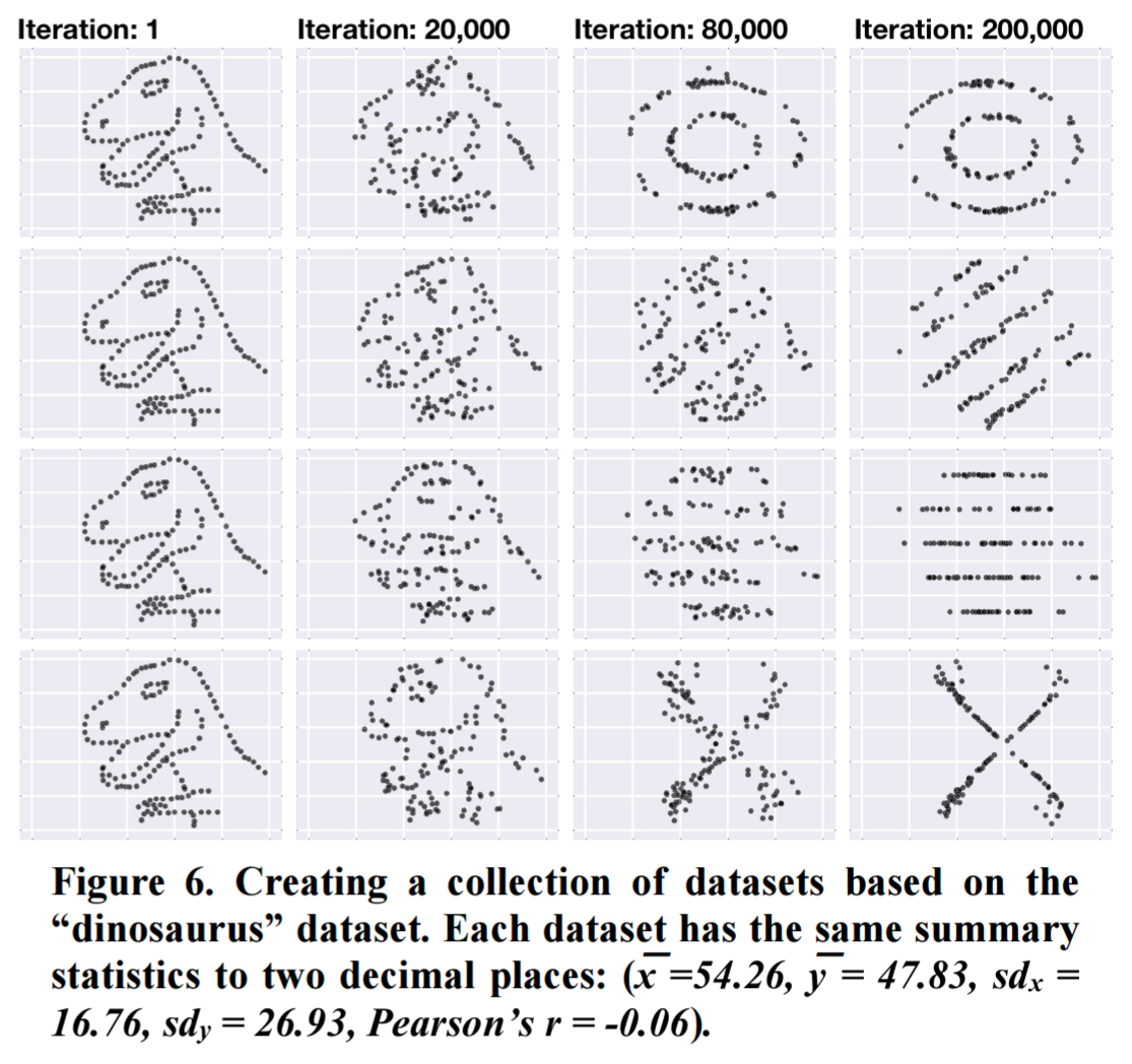
And of course you don’t have to start with a random cloud, you can evolve from any seed dataset. Here are some transformations from our friend the datasaurus:
Simpson’s paradox
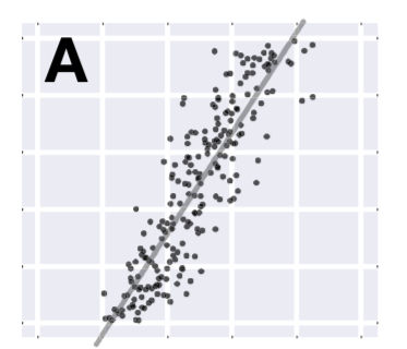
Here’s a fun example where the target shape is used to produce a dataset exhibiting Simpson’s paradox. Start out with a strongly positively correlated dataset, for example:
Then give the algorithm a target shape that directs the dataset towards a series of negatively sloping lines:
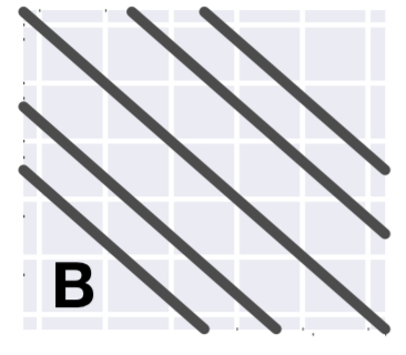
A few iterations later, and we have a dataset with the same overall strongly positive correlation that we started with, but each subset of the data has an individually negative correlation.
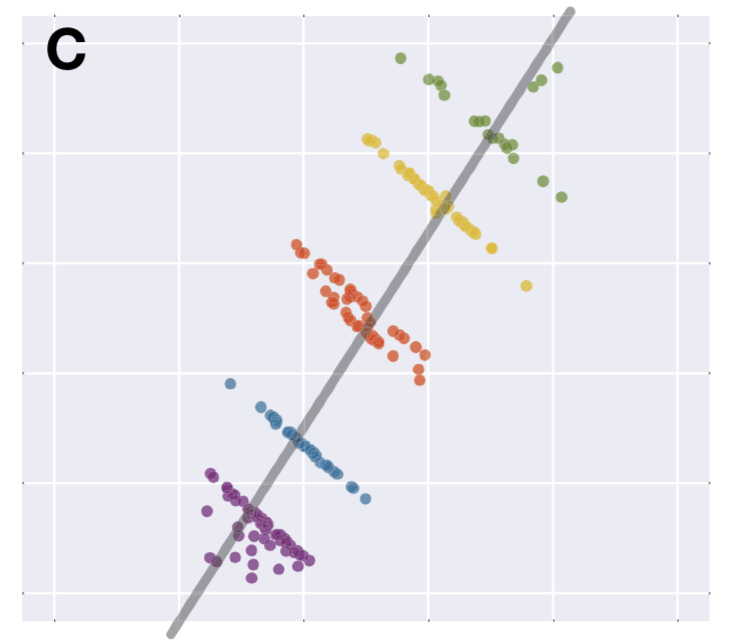
I find that a very satisfying way of demonstrating the effect!
Cloning datasets for anonymity
As discussed by Govindaraju and Haslett another use for datasets with the same statistical properties is the creation of “cloned” datasets to anonymise sensitive data. In this case, it is important that individual data points are changed while the overall structure of the data remains similar. This can be accomplished by performing a Kolmogorov-Smirnov test within the isErrorOk function…
This is clearly similar to the idea of adding noise to a dataset to enhance privacy. I guess I need to read Govindaraju and Haslett’s paper though, as it seems to me at first glance that if all you have maintained are the overall statistical properties you might as well provide those alone. Anything else inferred from the generated data must just be an artificial artefact? It must depend on how far you move from the original dataset…
The code and datasets presented in this work are available from www.autodeskresearch.com/publications/samestats.
If the thought of finding better insights through better visualisations inspires you, you might want to check out Miriah Meyer’s forthcoming book: ‘Making data visual: a practical guide to using visualisation for insight.’
5 thoughts on “Same stats, different graphs: generating datasets with varied appearance and identical statistics through simulated annealing”
Comments are closed.