Task-based effectiveness of basic visualizations Saket et al., IEEE Transactions on Visualization and Computer Graphics 2019
So far this week we’ve seen how to create all sorts of fantastic interactive visualisations, and taken a look at what data analysts actually do when they do ‘exploratory data analysis.’ To round off the week today’s choice is a recent paper on an age-old topic: what visualisation should I use?
No prizes for guessing “it depends!”
…the effectiveness of a visualization depends on several factors including task at the hand, and data attributes and datasets visualized.
Is this the paper to finally settle the age-old debate surrounding pie-charts??
Saket et al. look at five of the most basic visualisations —bar charts, line charts, pie charts, scatterplots, and tables— and study their effectiveness when presenting modest amounts of data (less than 50 visual marks) across 10 different tasks. The task taxonomy comes from the work of Amar et al., describing a set of ten low-level analysis tasks that describe users’ activities while using visualization tools.
- Finding anomalies
- Finding clusters (counting the number of groups with similar data attribute values)
- Finding correlations (determining whether or not there is a correlation between two data attributes)
- Computing derived values, for example, computing an aggregate value
- Characterising distributions, for example, figuring out which percentage of data points have a value over a certain threshold
- Finding extremes (i.e., min and max)
- Filtering (finding data points that satisfy a condition)
- Ordering (ranking data points according to some metric)
- Determining a range (finding the span of values – pretty straightforward if you can find the extremes – #6)
- Retrieving a value (identifying the values of attributes for given points)
If only our users were using SQL and not a visualisation tool :).

Study design
Two datasets were chosen such that participants would be familiar with the meaning of the data attributes, but not the actual content: a cars dataset with data on 407 new cars, and a movies dataset with details of 335 movies. Both datasets contain a mix on nominal (categorical), ordinal (quantities with a specific range and natural ordering, e.g. movie ratings), and numerical data attributes.
Following an initial pilot, the study focused in on visualisations containing no more than 50 visual marks (participants found it too time-consuming above this number). Within this constraint visualisations were generated across all give visualisation types using the following pairwise combinations of all the attribute types: nominal * numerical, ordinal * numerical, and numerical * numerical.
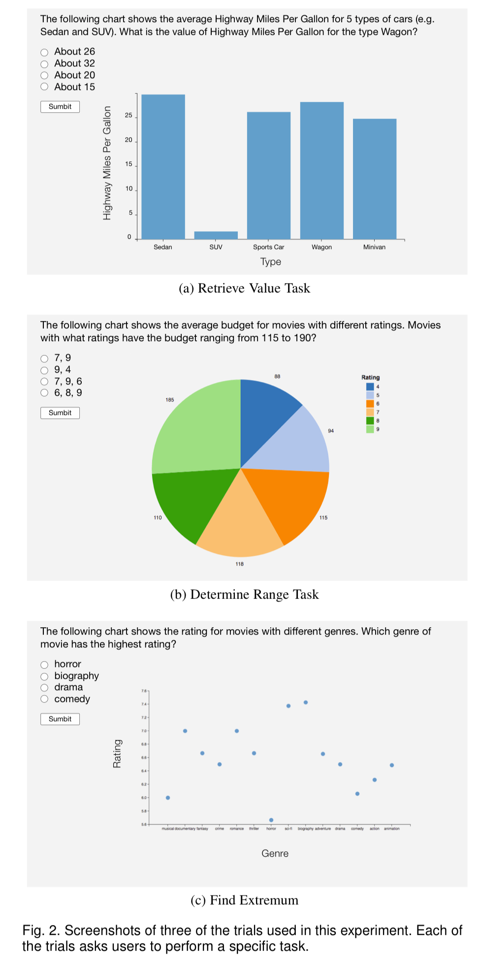
180 Mechanical Turk participants with previous experience of visualisation completed the study. 18 participants were assigned to each of the ten task types, and participants for a given task type answered 30 different questions relating to the task (5 visualisation types x 2 datasets x 3 trials). Example task questions are shown in the figure below. After completing their questions, participants were then asked a set of ranking questions to determine their preferred visualisation type(s) for performing the task.

And the winner is…?
Results, aggregated over tasks and datasets, show the Bar Chart is the fastest and most accurate visualization type.
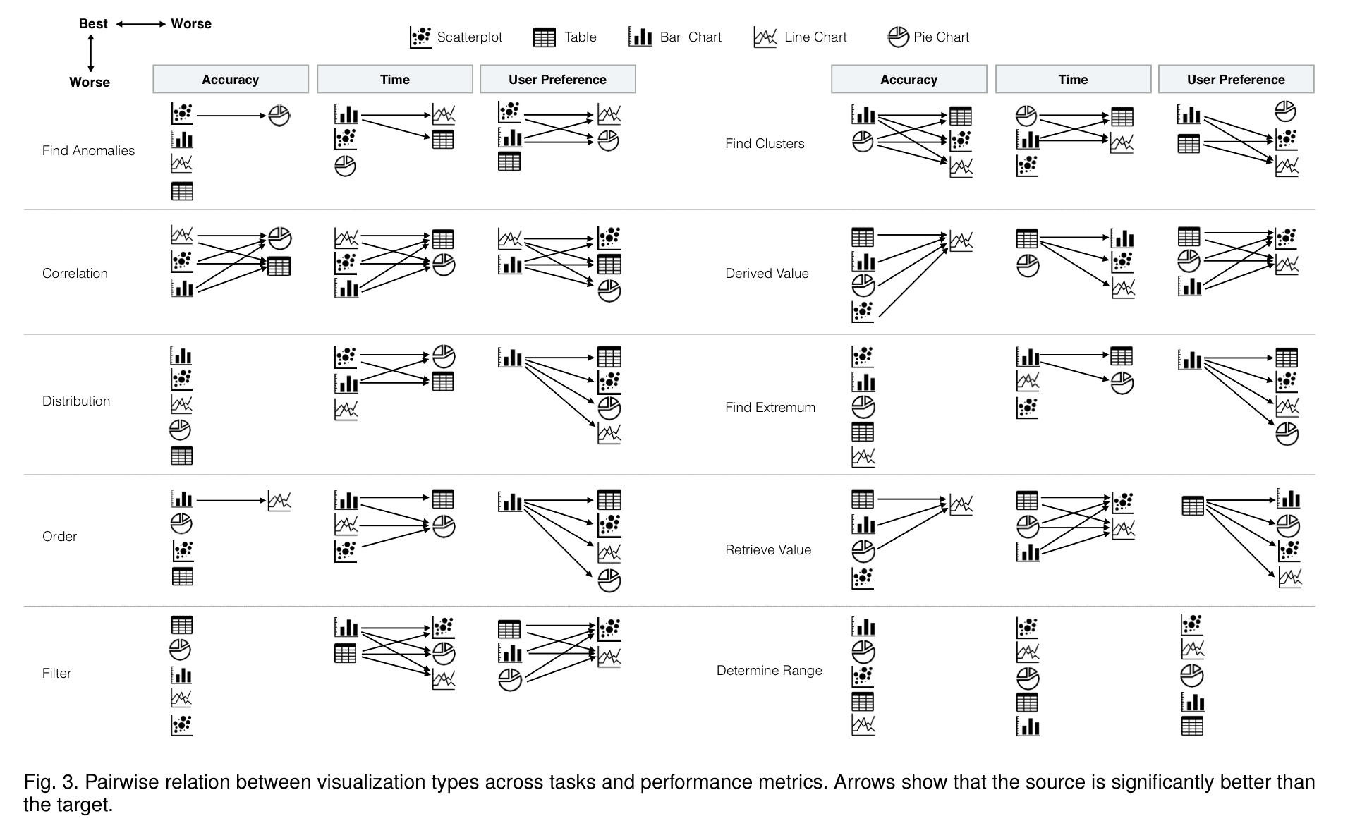
But to stop there would be to miss the point. Taking into account the accuracy with which users performed a task, the time it took them, and their own stated preferences, here’s a concise summary of how well the different visualisation do on a per-task basis.

Bar charts and tables are the visualisation types most preferred by participants. This holds even though performance when using table is relatively slow and less accurate. If you want the full details, check out the (page-and-a-half-long!) Table 1 in the paper. Cutting to the chase, here’s the condensed advice on selecting a visualisation type:
- Use bar charts for finding clusters. Performance on this task was similar with both pie charts and bar charts, but users preferred bar charts. Recall that ‘clusters’ here means answering questions such as ‘how many different movie genres are shown in the chart?’ – not the kind of clustering you may be primed to think of from kNN etc..
- Use line charts for finding correlations. Line charts and scatterplots are both good for this, but user prefer line charts.
- Use scatterplots for finding anomalies – they have high accuracy and speed, and are highly preferred by users on this task
- Avoid line charts for tasks that require readers to precisely identify the value of a specific data point – it’s harder to identify a specific value using this visualisation type.
- Avoid tables and pie charts for correlation tasks, they are less accurate, slower, and less preferred for this task.
If you’re using visualisations to accompany a report or article, you can turn that around and say e.g. “use line charts to support a point about correlation” and so forth. If you just want to present data for readers to explore on their own without a specific a priori task or point to support, bar charts and tables are the go-to visualisation.
The last word
So, about those pie-charts…
…throughout the history of graphical perception research, pie charts have been the subject of passionate arguments for and against their use. Although the current common wisdom among visualization researchers is to avoid them, pie charts continue to be popular in everyday visualizations. Results of our study present a more nuanced view of pie charts.
Should you use a pie-chart? It depends… they were shown to be competitive on cluster, extremum, filter, range, and retrieval tasks.
12 thoughts on “Task-based effectiveness of basic visualizations”
Comments are closed.