A dirty dozen: twelve common metric interpretation pitfalls in online controlled experiments Dmitriev et al., KDD 2017
Pure Gold! Here we have twelve wonderful lessons in how to avoid expensive mistakes in companies that are trying their best to be data-driven. A huge thank you to the team from Microsoft for sharing their hard-won experiences with us.
In our experience of running thousands of experiments with many teams across Microsoft, we observed again and again how incorrect interpretations of metric movements may lead to wrong conclusions about the experiment’s outcome, which if deployed could hurt the business by millions of dollars.
Warning: I definitely exceeded by usual length target with this post – there was just too much good stuff that I didn’t want to leave out. I hope you find the extra time it takes to read through worth it!
Before we dive into the details, there are a couple of interesting data points about experimentation at Microsoft I wanted to draw your attention too:
- Microsoft have an experimentation system used across Bing, MSN, Cortana, Skype, Office, xBox, Edge, Visual Studio, and so on, that runs thousands of experiments a year.
- This isn’t just fiddling on the margins – “At Microsoft, it is not uncommon to see experiments that impact annual revenue by millions of dollars, sometimes tens of millions of dollars.”
If we’re going to talk about metric interpretation then first we’d better have some metrics. Section 4 in the paper has some excellent guidelines concerning the types of metrics you should be collecting. You’re going to need a collection of metrics such as these in order to diagnose and avoid the pitfalls.
Let’s talk about metrics
Most teams at Microsoft compute hundreds of metrics to analyze the results of an experiment. While only a handful of these metrics are used to make a ship decision, we need the rest of the metrics to make sure we are making the correct decision.
There are four primary classes of metrics that Microsoft collects:
- Data Quality Metrics. These help to determine whether an experiment was correctly configured and run, such that the results can be trusted. An important example is the ratio of the number of users in the treatment to the number of users in the control. You need this metric to avoid the first pitfall…
- Overall Evaluation Criteria (OEC) Metrics. The leading metrics that determine whether the experiment was successful. These are metrics that can both be measured during the short duration of an experiment, and are also indicative of long term business value and user satisfaction. In the ideal case, a product has just one OEC metric.
- Guardrail Metrics. “In addition to OEC metrics, we have found that there is a set of metrics which are not clearly indicative of success of the feature being tested, but which we do not want to significantly harm when making a ship decision.” These are the guardrail metrics – on MSN and Bing for example, page load time is a guardrail metric.
- Local Feature and Diagnostic Metrics. These measure the usage and functionality of individual features of a product. For example, click-through rates for individual elements on a web page. These metrics often help to diagnose / explain where OEC movement (or lack of it) is coming from. They can also reveal situations where improvements in one area harm other areas.
Pitfall #1: Metric sample ratio mismatch
Here’s a puzzler for you:
We ran an experiment on the MSN.com homepage where, when users clicked on a link, in treatment the destination page opened in a new browser tab while in control it opened in the same tab. The results showed 8.32% increase in Page Load Time (PLT) of the msn.com homepage. How could this one line JavaScript
change cause such a large performance degradation?
The PLT metric is simple the average load time for all pages in a variant (control or treatment), i.e., sum of all page load times for a variant, divided by number of page loads in the variant. (I know you know what average means, there’s a reason I’m spelling it out!). This gives us a clue that the number of page loads matters. With results opening in the same tab, users often use the back button to go back to the results page – this results in more page loads (versus keeping the results tab open in the treatment), and those loads are faster due to the browser cache.
Clearly, the set of page loads over which the metric was computed were different between the treatment and the control. In a situation like this the metric value cannot be trusted.
This is a sample ratio mismatch, and if it happens all bets are off. Without being aware of this you can make misinformed decisions.
…it is critical that the experimentation system automatically detects sample ratio mismatches and warns the user about them… A good start is to look separately at the numerator and denominator of the metric.
Pitfall #2: Misinterpretation of ratio metrics
On the MSN homepage, a module located close to the bottom of the main page was moved to a higher position on the page so that less scrolling was needed to reach it. The click-through rate (CTR) of the module decreased by 40%! That doesn’t sound right!
Take a look at the metric:
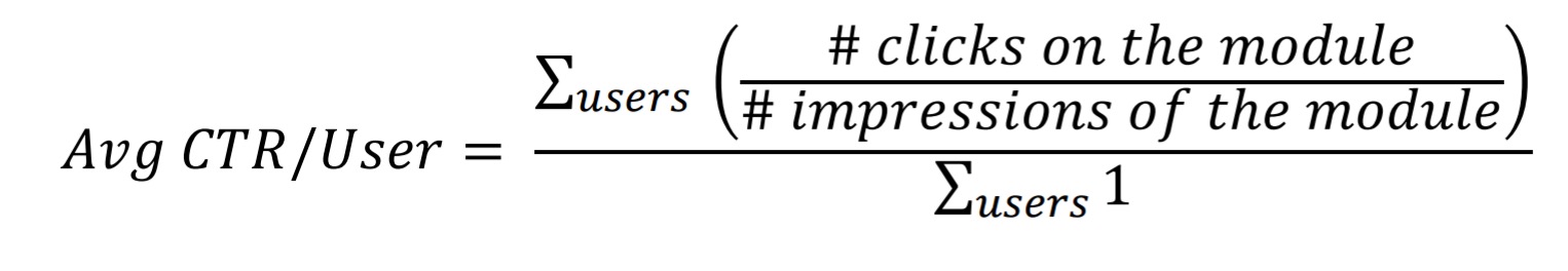
If you think about it for a moment, you’ll realise that a lot more users are seeing the module. In fact, both the number of times the module was seen, and the number of clicks on the module went up. It’s just that the former went up more than the latter. Overall page CTR stayed flat, but revenue actually increased because the promoted module was more monetizable than those that were pushed down to make room for it. So a 40% decrease in CTR turned out to be a good thing!
Ratio metrics can be misleading or potentially invalid if the denominator of the metric changes.
The authors’ preferred way to compute ratio metrics is as the average of ratios (as in the example metric in this section). This tends to give higher sensitivity and greater resilience to outliers.
To detect denominator mismatch in ratio metrics, we recommend to always define count metrics for the numerator and the denominator, and provide those in the result alongside the ratio metric.
Pitfall #3: Telemetry loss bias
Skype experimented with a protocol change for delivering push notifications. The result showed strong statistically significant changes in some call-related metrics such as fraction of successfully connected attempted calls. But the notification mechanism has absolutely nothing to do with calls!
The push notifications were waking up the device, allowing it enough time to check whether it was on wifi, and if so prepare a telemetry batch and send it over. Server-side metrics were unchanged (total capture), but more client-side metrics were being delivered.
Since the new events that make it (or events that are lost) are typically a highly biased set, telemetry loss bias practically invalidates any metrics that are based on the affected events… Therefore, for every client event used in metrics, a Data Quality metric measuring the rate of the event loss should be created.
The simplest way is to compare to a corresponding server event if you have one. In the absence of that you can assign sequence numbers client side and look for gaps in the sequence.
Pitfall #4: Assuming underpowered metrics had no change
In one MSN.com experiments, page views went up by 0.5% (that’s a meaningful impact on the business), but the associated p-value was not statistically significant. Should we assume no true impact on page views? An investigation revealed that the experiment did not have enough power for the metric.
Power is the probability of rejecting the null hypothesis given that the alternative hypothesis is true. Having a higher power implies that an experiment is more capable of detecting a statistically significant change when there is indeed a change.
Before an experiment you should conduct an a priori power analysis to estimate sufficient sample sizes – at the very least for OEC and Guardrail metrics. Often the sample size will be the same for typical experiments on a given product – e.g., for Bing experiments in the US the rule of thumb is at least 10% of users for one week.
We recommend to have at least 80% power to detect small enough changes in success and guardrail metrics to properly evaluate the outcome of an experiment.
Pitfall #5: Claiming success with a borderline p-value
A Bing.com experiment gave a statistically significant positive increase in one of the OEC metrics, with a p-value of 0.029. Shall we celebrate and ship it?
In Bing.com whenever key metrics move in a positive direction we always run a certification flight which tries to replicate the results of the experiment by performing an independent run of the same experiment.
Even in A/A experiments the behaviour of metrics can be seen flipping between statistically significant and not. (Clearly they aren’t, by construction!) Always re-run experiments which have borderline p-values, if the effects continue to be borderline and the traffic can’t be increased, Fisher’s method can be used to obtain a more reliable conclusion.
Pitfall #6: Continuous monitoring and early stopping
You’ve probably heard about this one… an experiment is showing statistically significant results already, before the scheduled finishing time, can we stop it? Likewise, an experiment isn’t showing the effect we hoped for, can we keep running it for longer just in case? No, and no.
In our experience, stopping early or extending the experiment are both very common mistakes experiment owners make. These mistakes are subtle enough to even make it into recommended practices in some A/B testing books. The issue is exacerbated by the fact that in practice continuous experiment monitoring is essentially a requirement to be able to shut down the experiment quickly in case a strong degradation in user experience is observed.
You can either (a) train experiment owners not to do this, (b) adjust p-values to account for extra checking, or (c) use a better test than p-values. For example, a Bayesian framework naturally allows for continuous monitoring and early stopping.
Pitfall #7: Assuming the metric movement is homogeneous
Sometimes treatments have differing affects on different subsets of the treatment groups (e.g., users in different countries, or the feature not working correctly in certain browsers). If you’re not aware of such effects you may end up shipping a feature that improves user experience overall, but substantially hurts experience for a group of users.
Due to a large number of metrics and segments that need to be examined in order to check whether there is a heterogenous treatment effect, it’s pretty much impossible to reliably detect such effects via a manual analysis.
The Microsoft system automatically analyses every experiment scorecard and warns if heterogenous treatment effects are found.
Pitfall #8: Segment (mis)interpretation
Segmenting users is pretty common, but interpreting metric movements on segments needs to be done with extra care. You may well have heard of Simpson’s paradox, which shows how it is possible for a metric to go up in every individual segment, but still go down overall for example. The condition used for defining a segment must not be impacted by the treatment.
If statistically significant difference is observed (in sample ratios), the results for that segment group, and often for all other groups in the segment, are invalid and should be ignored. A common way to run into Simpson’s paradox is to keep recursively segmenting the users until a statistically significant difference is found.
Recursive segmentation is also an instance of the multiple comparisons problem.
Pitfall #9: Impact of outliers
On the MSN.com homepage, the number of images in the slideshow at the top of the page was increased. The result showed a significant decrease in engagement, the opposite of what was expected. It turned out that the experiment increased engagement so much that real users were being labelled as bots!
Outliers can skew metric values and increase the variance of the metric making it more difficult to obtain statistically significant results. Because of this, it is common to apply some kind of filtering logic to reduce the outlier impact. As the example above shows, however, one needs to ensure that all variants in the experiment are impacted by the outlier filtering logic in the same way.
The authors recommend always having a metric that counts the number of values affected by outlier handling logic in the Data Quality Metrics section.
Pitfall #10: Novelty and primacy effects
We added a shiny thing, and engagement went up, yay!
When we looked at the experiment results for each day segment, we found that the percent delta in clicks on top sites between treatment and control declined quickly, suggesting a novelty effect.
What you really want of course, is to understand the long-term impact on the business and users. Ignoring novelty effects can lead to an investment in features that aren’t worth it in the long run. On the flip side of the coin, primacy effects are those where initial treatment effects appear small in the beginning, but increase over time (e.g., as a machine learning system better adapts). When a feature has suspected primacy effects you can do a ‘warm start’ so that the marginal improvement in performance over time is smaller.
We also recommend segmenting treatment effect by different days of the experiment, or different user visits, to see if the treatment effect changes over time.
Pitfall #11: Incomplete funnel metrics
For funnel metrics, you need to measure all parts of the process. And with final success rates often as low as 1%, you need to take care to ensure that the metrics at every step are sufficiently powered to detect any significant changes.
At every step of the funnel we need to ensure that the success rates are compared and not just the raw clicks or user counts. In addition, we should measure both conditional and unconditional success rate metrics. Conditional success rates are defined as the proportion of users that complete the given step among users that attempted to start the step. Unconditional success rates compute the success rate taking into consideration all users who started at the top of the funnel.
Pitfall #12: Failure to apply Twyman’s Law.
If you see an unexpected metric movement, positive or negative, it normally means there is an issue. For example, a too-good-to-be-true jump in number of clicks turned out to be because users were confused and clicking around trying to figure things out!
Twyman’s law says that any figure that looks interesting or different is usually wrong.
Even surprising results that appear to be positive should be treated with skepticism.
At Microsoft, we have configured automated alerts and auto-shutdown of the experiments if we detect unexpected large metrics movements in both the positive and negative directions.
Further reading…
If you enjoyed today’s paper, you might also like:
- Measuring Metrics, Dmitriev & Wu CIKM 2016 – more on defining and evaluating good metrics that capture long-term company goals.
- Data-Driven Metric Development for Online Controlled Experiments: Seven Lessons Learned, Deng & Shi, KDD 2016 – how to create metrics you can trust
- Principles for the Design of online A/B Metrics, Machmouchi & Buscher, SIGIR’16 – a short two-pager introducing the idea of metric hierarchies
- A Dirty Dozen: Twelve p-value misconceptions, Goodman 2008 – a catalogue of 12 p-value pitfalls, and the inspiration for today’s paper.
I may cover some of these in future editions of The Morning Paper too.